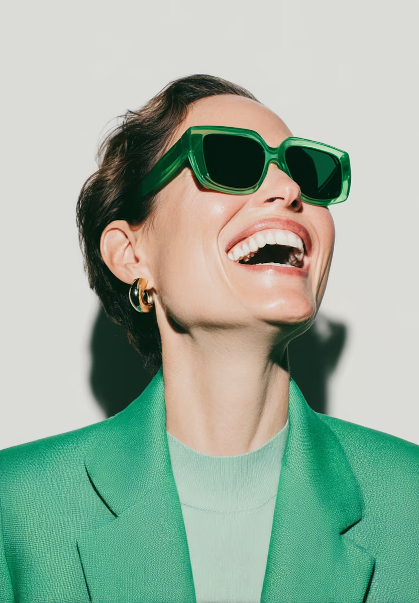

The Subtle Art Of Shade Matching For Olive Skin
.webp)

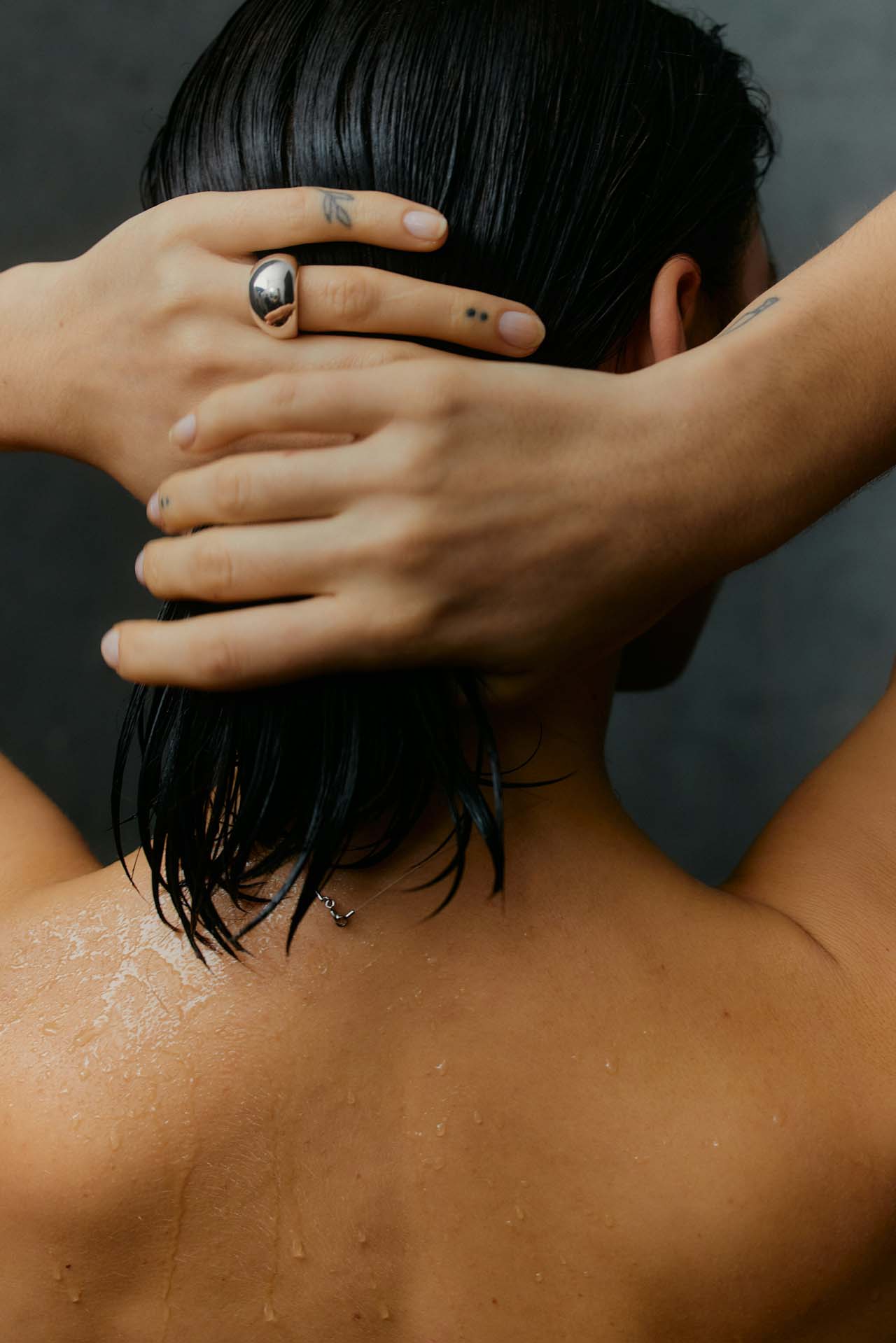
I didn’t even know I had olive skin. When it came time to start wearing makeup, Charlotte Tilbury’s Pillow Talk was all anyone could talk about. Of course, I wanted it — I wanted to match my friends and look like the YouTube beauty influencers who defined beauty in the 2010s. But it just never looked…right. The warm pink clashed with my features, so I pivoted to bright peaches. Those completely washed me out. And don’t even get me started on red lipstick. The first time I wore it, my mum took one look at me and started laughing. She quickly apologised and said, “Sweetheart, please don’t ever wear red lipstick again.”
Why was finding my makeup shade so incredibly difficult? Walking into any department store meant hundreds of options, yet none of them seemed to be made for me. Eventually, I went back to my mum — who effortlessly wore one shade of MAC lipstick throughout my childhood. It was this dusty mauve, brown-berry-plum hybrid. Hard to describe — maybe that’s why it never went mainstream. But the first time I tried it on, everything clicked. My face looked balanced, finally.
I still didn’t know I had olive skin. I just knew that the shades that looked great on my friends weren’t the ones that worked for me. So I stayed in my lane: deeper, mauvier lipsticks and blushes. Bronzers? That’s another story altogether…I’ll spare you the orange bronzer phase.
If you’ve ever felt like your makeup looks heavier, harsher, or just “off” compared to someone else’s, the truth might not be the product at all — it might be the shade. Makeup should blend into your skin, not sit on top of it.
It took me years to understand why this kept happening. I only learned I had olive undertones a couple of years ago. As a Persian woman, I’d always assumed gold jewellery was my best match — wasn’t that the rule? But when I actually tried silver, it looked just as good. That’s when I realised I didn’t fit neatly into the warm/cool binary that most beauty advice revolves around. Some foundations turned me yellow, others pink — and sometimes, in winter, my skin leaned a little grey.
Here’s the thing: olive overtones aren’t rare. They’re just overlooked. The industry has done a beautiful job expanding shade ranges for deeper and fairer complexions, but undertones and overtones — especially complex ones like olive — are still widely misunderstood.
The key is noticing how colours interact with your natural skin. Test shades in natural light. Pay attention not just to the colour itself, but to how your skin looks next to it: brighter? Duller? More balanced? Ignore “universally flattering” marketing. What’s flattering is what makes you look alive.
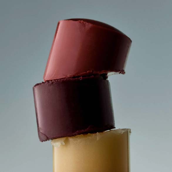
When I started discovering shades that actually worked for my undertone, everything changed. I began prioritising clean, gentle formulas with skincare-infused ingredients that don’t just look better on the skin — they feel better. Now, I gravitate towards rich berries, muted terracottas, and those dusty mauve-brown hybrids that never steer me wrong. What I avoid: pastels, overly neon shades, or reds that turn orange on me. The right shade means you can wear less makeup overall — your face just looks cohesive without the extra effort.
This philosophy guided me when I began developing shades of my own at SOSHE. I wanted a curated selection that would take the guesswork out of beauty, not overwhelm people with endless “almost right” options. Shades that complement each other across lips, eyes and cheeks — and, most importantly, work with undertones and overtones often ignored by mainstream brands.
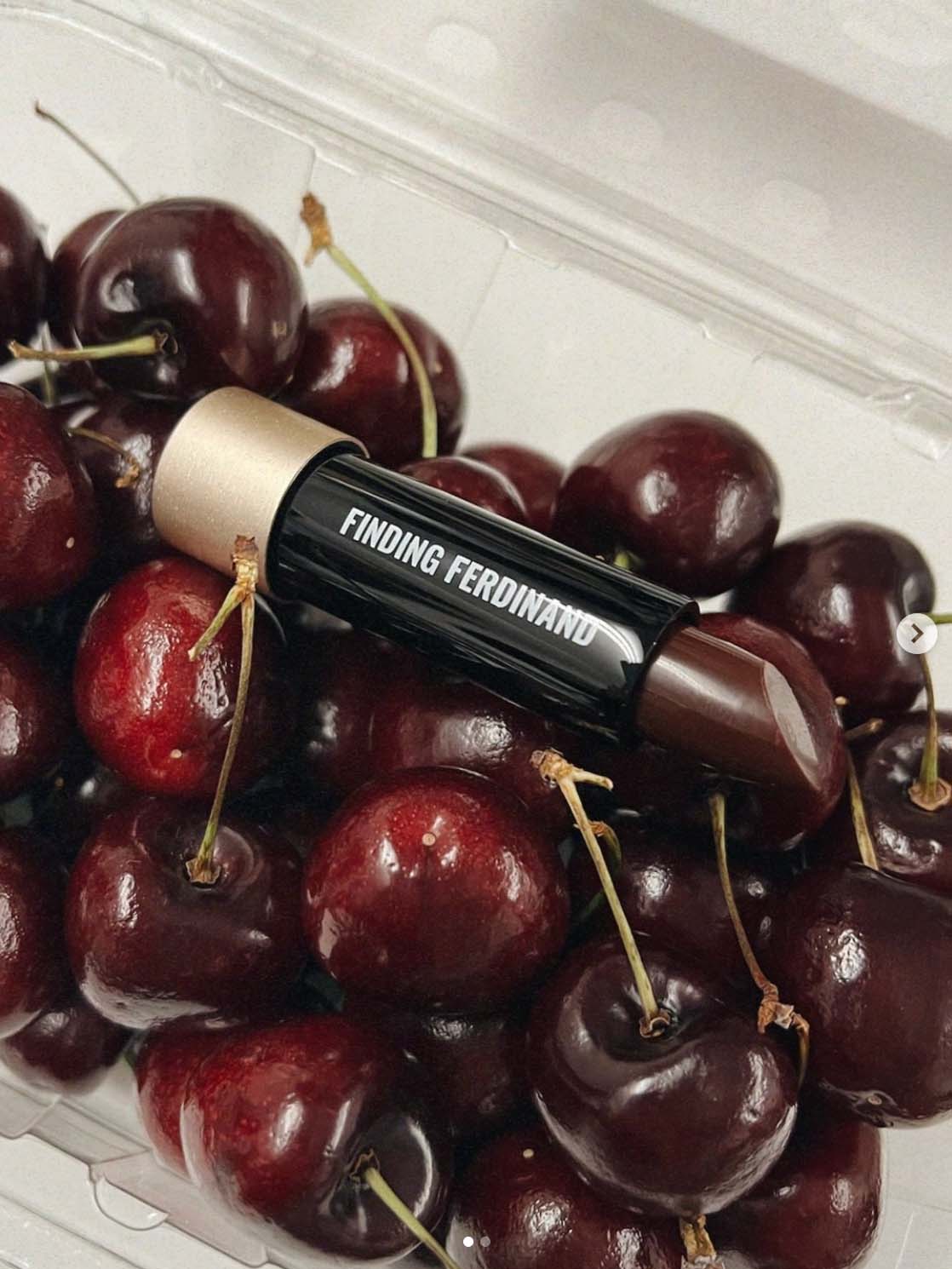
Finding my complementary shades was never just about makeup. It was about learning to see myself clearly — to stop trying to squeeze into standards that weren’t built for me and instead, build my own. That one brown-berry-plum lipstick my mum wore in the ’90s ended up being more than nostalgia — it was my blueprint. It inspired our best-selling shade Speakeasy, now developed in a matching lipstick, lip liner and blush. Every time I put it on, I think of my mum, and how I finally feel at home in my own skin.
A Quick Shade Match Guide
Olive is an overtone, not an undertone.
You can still have warm or cool undertones beneath olive — which is why some olives look amazing in gold, others in silver, and some in both. The subtle “greenish cast” is what makes olive unique, and why so many shades look slightly off.
Neutral undertones are actually rare.
Most people lean slightly warm or cool, even if it’s subtle. So if nothing looks right, you may not be “neutral” — you might just be olive.
The wrist vein test:
Look at your veins in natural light.
- Green = warm undertone
- Blue or purple = cool undertone
- A mix or hard to tell = olive or neutral
Check your skin in daylight.
Hold a plain white T-shirt under your chin.
- If your skin looks golden, you’re warm.
- If it looks rosy, you’re cool.
- If it looks a little greenish or muted, you’re olive.
Think in shade families.
- Warm undertones: corals, peaches, golden bronzes
- Cool undertones: berry pinks, blue-based reds, rosy blush
- Olive overtones: mauves, terracottas, dusty plums, muted berries
Less is more.
Once you land on the right undertone–overtone balance, you’ll find you need fewer products — because everything looks naturally cohesive.